Sky x WithU
Founding Product Designer (Lead)
Overview
End-to-end ownership of a 0→1 fitness TV app for Sky, from concept through to multi-platform launch across Sky Q, Sky Glass, and Sky Stream. I led product vision, UX strategy, and UI design — acting as sole design lead and collaborating closely with product, engineering, and Sky stakeholders throughout.
The goal was to create an engaging, accessible fitness experience tailored entirely to the living room: large screens, remote controls, and users who are mid-workout.
The problem
Designing for TV means starting from scratch. The interaction model is fundamentally different from mobile or desktop — users navigate with a remote, sit back from the screen, and need to switch between browsing and exercising with minimal friction.
When I joined, initial wireframes created by a junior designer were built on web and mobile conventions. The navigation was complex, the hierarchy unclear, and the layouts didn't account for how people actually use a TV. Discovery was friction-heavy and the experience fell apart the moment someone picked up a remote.
My role
Sole design lead across the full product lifecycle — from defining the product vision and interaction model, through to delivering production-ready UI across three Sky platforms. I shaped product decisions, ran stakeholder alignment with Sky, and worked closely with engineering to ensure what I designed was feasible at pace.
Left: wireframes (junior designer) | Right: revised information architecture & funnelled user journey
Approach
Rather than iterate on what existed, I reframed the problem around the constraints: remote-first navigation, lean-back consumption, and a user who is physically active while using the product.
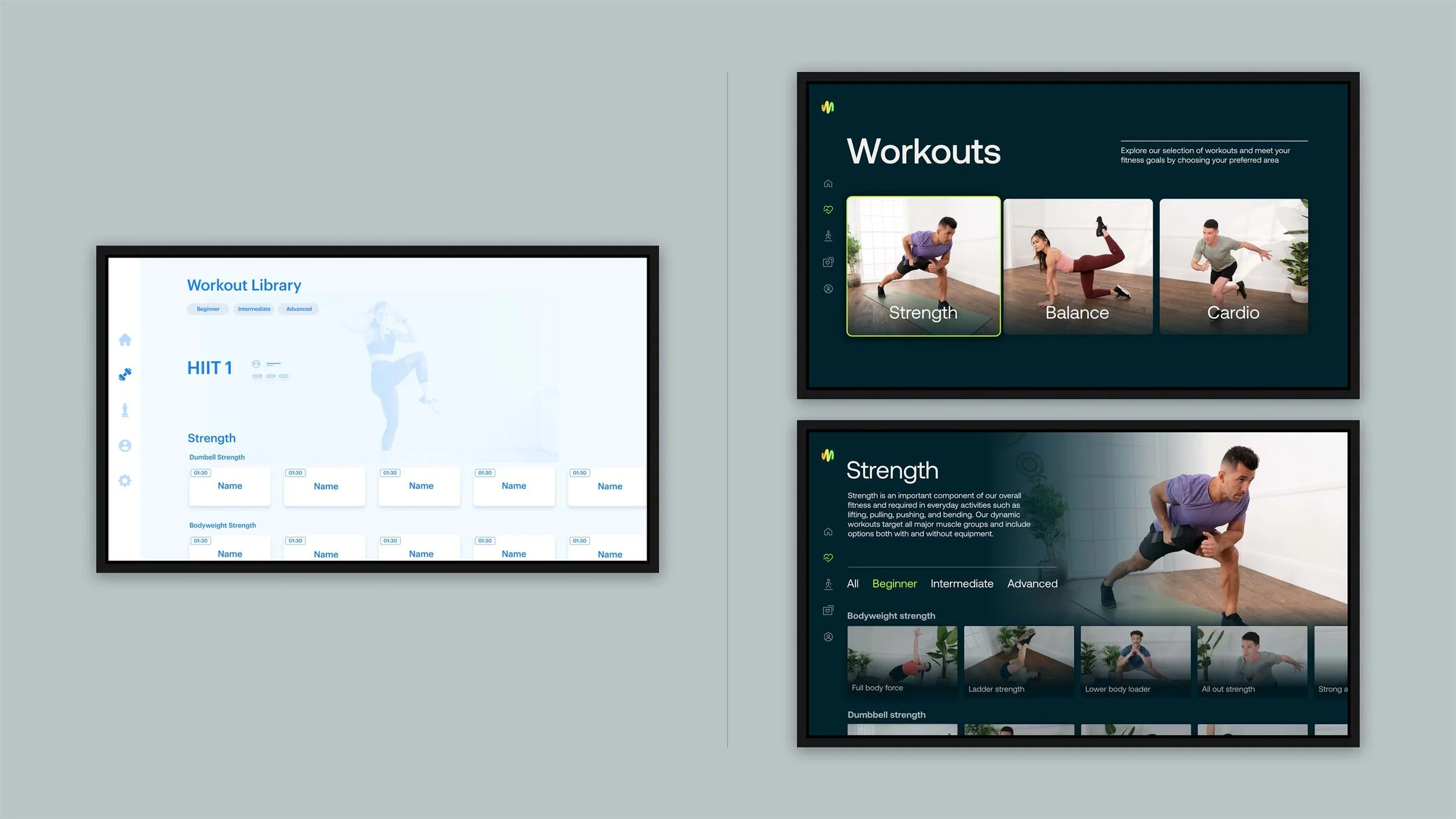
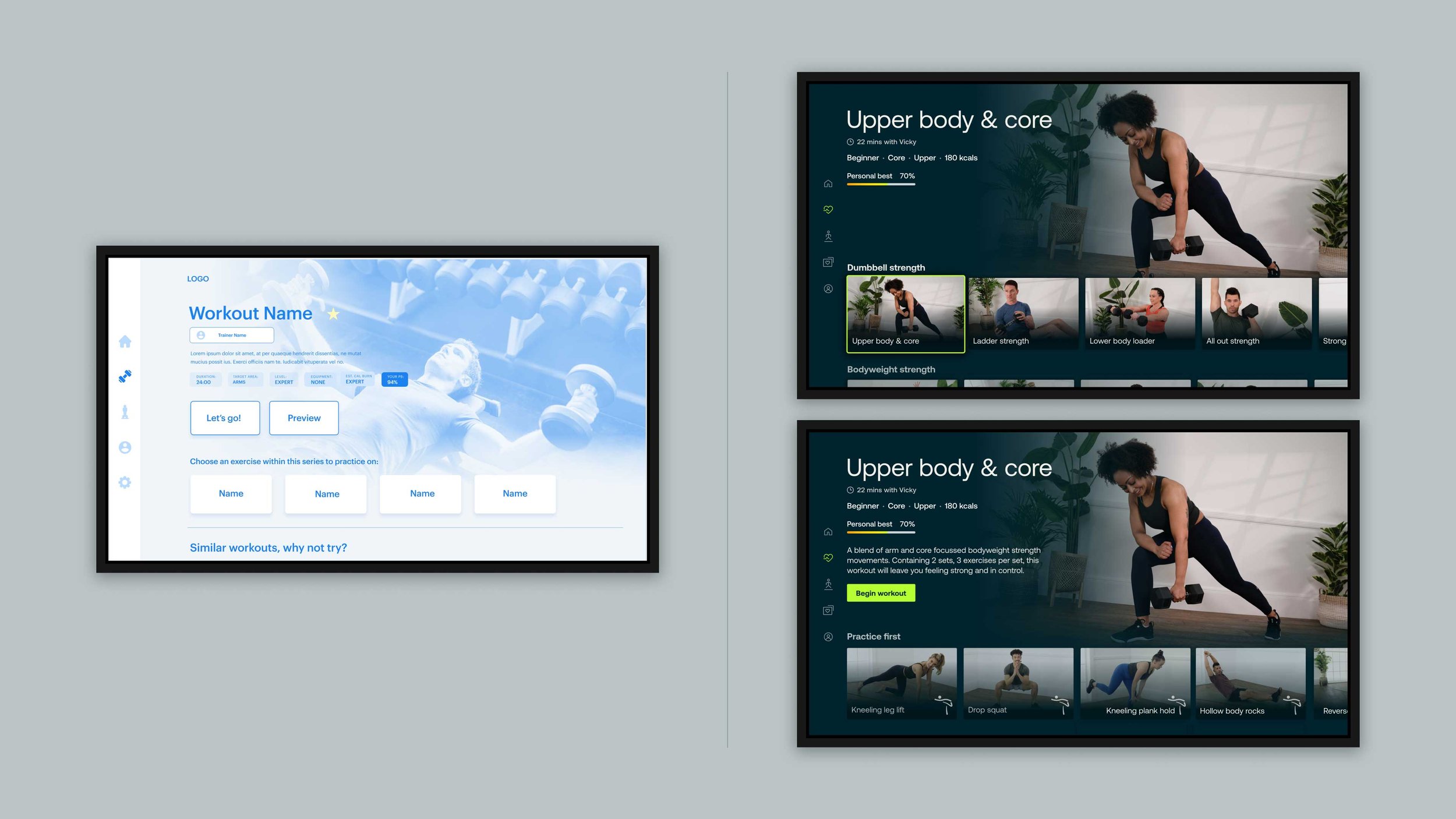
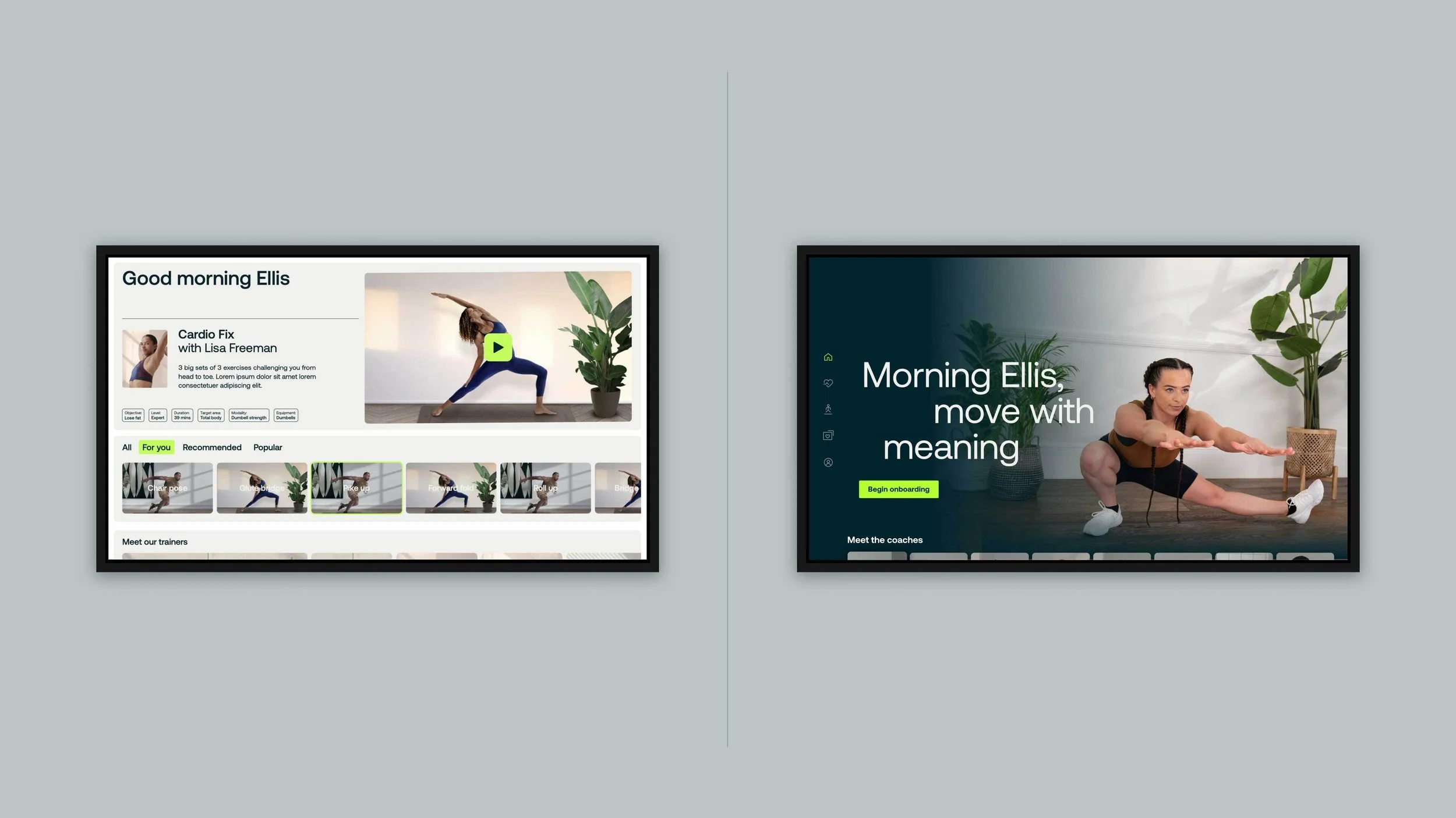
I conducted a content audit to understand what was there and what was unnecessary, then rebuilt the information architecture around clear, guided journeys — reducing the number of decisions a user has to make at each step. I introduced a category-first structure with hero pages to anchor workout discovery, and simplified the side navigation to work within the limits of a remote.
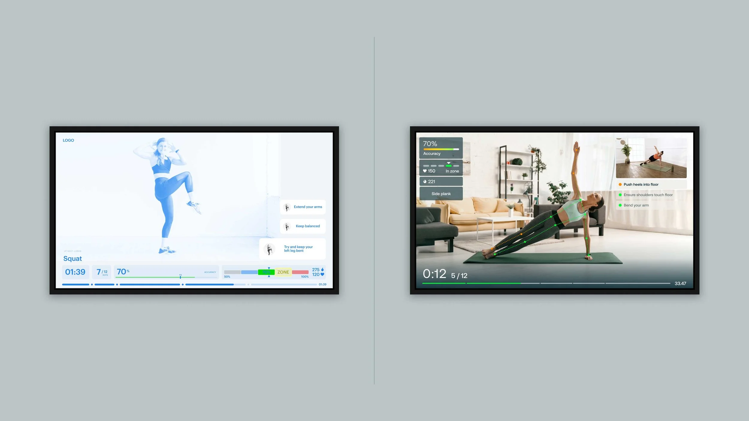
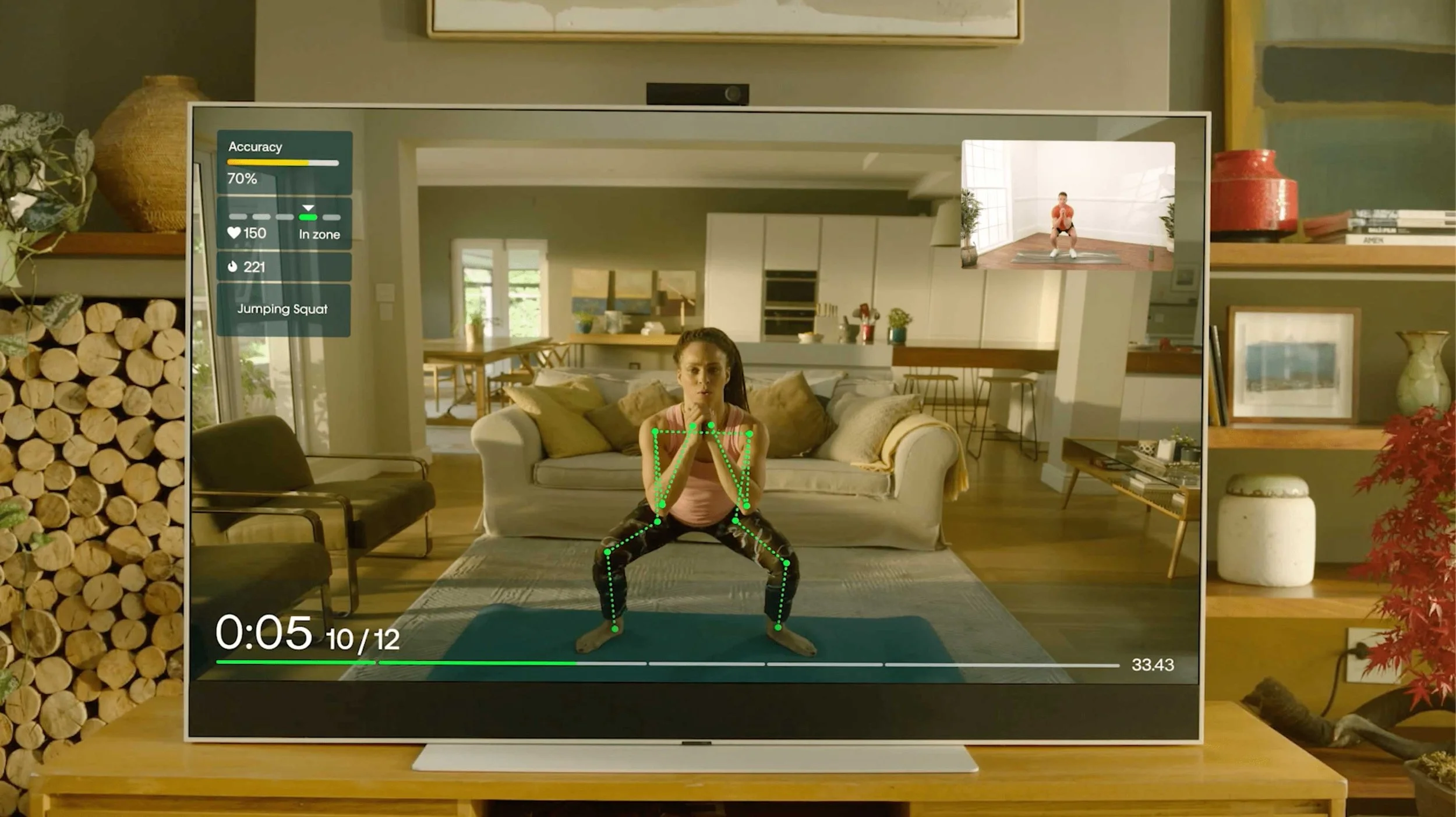
Where research was available — primarily through stakeholder insight and early user feedback — I used it to challenge assumptions. One finding that shaped the product: users found the camera view during workouts off-putting. Rather than push back, I introduced the option to disable it. A small change, but one that removed a real barrier to engagement.
Key product & design decisions
Remote-first navigation
Stripped back navigation patterns to minimise button presses and reduce cognitive load during browsing. Every interaction was stress-tested against the question: can someone do this with four directional buttons and a
select key?
Lean-back content structure
Organised content to support passive browsing, with a clear and fast path into active workout sessions. The browse-to-play journey was a primary focus throughout.
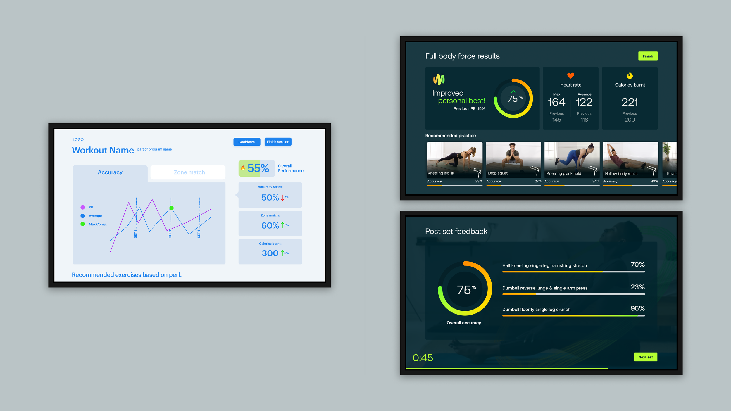
Motivation and feedback design
Introduced light gamification (performance tracking, achievement badges, personal bests) and redesigned the post-workout experience to surface contextual stats during cooldown rather than front-loading them. Feedback tone was shifted to be supportive and encouraging, with negative colour cues reduced in performance scoring
Large-screen UI
High contrast, large typography, and unambiguous hierarchy designed for distance viewing. The studio set was bright white, so I chose a dark UI to create contrast, reduce visual strain, and direct focus to content.
Design system
Built a library of reusable components and patterns optimised for TV, providing a scalable foundation for future feature development
Impact
Multi-platform launch
Delivered a 0→1 product across multiple Sky platforms (Sky Q, Sky Glass, Sky Stream)
Scalable foundation
The component library and interaction patterns I established supported ongoing content and feature development post-launch.
First-of-its-kind, machine learning TV fitness experience
Defined the interaction model for a first-of-its-kind ML-powered fitness experience on TV — establishing remote-based navigation patterns from scratch and designing around real-time movement tracking via the device camera to deliver form feedback during live workouts
Media coverage
The launch was covered by Women's Health among other outlets with a positive reception, contributing to early awareness and a broad audience at launch.
Reflection
This was one of the most technically constrained projects I've worked on, and that constraint turned out to be a creative advantage. Designing for remote navigation forced a level of simplicity that improved the experience for everyone — there was no room for complexity.
If I were to do it again, I'd push earlier for more structured user research sessions rather than relying primarily on stakeholder insight. The camera finding came late and changed the product meaningfully — earlier and more regular user contact would likely have surfaced that sooner, and probably other things too.