Ramsay Health Care
Project lead
Lead product designer
Overview
Ramsay Health Care's booking process was entirely call centre-led — creating friction for patients and operational strain for staff. I led end-to-end design of a digital self-serve booking platform to replace it: a scalable, accessible experience that gives patients visibility over availability, pricing, and treatment options without needing to pick up the phone.
I owned the full design process and led a cross-functional team of a content designer, UX designer, business analyst, researchers, and engineers across discovery through to phased rollout.
The problem
Patients had no way to browse availability, compare options, or get a clear picture of cost without calling in. That created a bottleneck — high call volumes, slow booking journeys, and a significant drop-off rate from patients who simply gave up.
The challenge was designing a digital experience that felt genuinely effortless for a user base skewing older (55+), while navigating complex backend constraints from the MAXIMS system and strict accessibility requirements.
Discovery & alignment
I partnered with the research team to synthesise user needs across qualitative and quantitative studies. Accessibility, speed, and ease of use emerged as the primary drivers — particularly for older users who found competitor experiences confusing or overwhelming.
To ensure the product was buildable, not just desirable, I ran stakeholder workshops early to surface technical constraints, operational realities, and business priorities — aligning the team before a line of design work was done.
Key product & design decisions
Surface earliest availability first.
Research consistently showed users prioritised speed over location. We restructured the booking flow around soonest available appointments rather than defaulting to nearest hospital — a simple reframe that better matched how patients actually think.
Redesign for cognitive ease
Reduced cognitive load by restructuring content, improving usability for older users and those with accessibility needs.
Make filters work harder
Usability testing flagged that filtering was easy to miss and awkward to use. We redesigned it to be prominent, persistent, and intuitive — giving users real control without adding complexity.
Introduced pricing transparency
Vague cost estimates were a trust killer. We replaced them with clear, upfront pricing — reducing uncertainty and one of the key reasons users were abandoning to call instead.
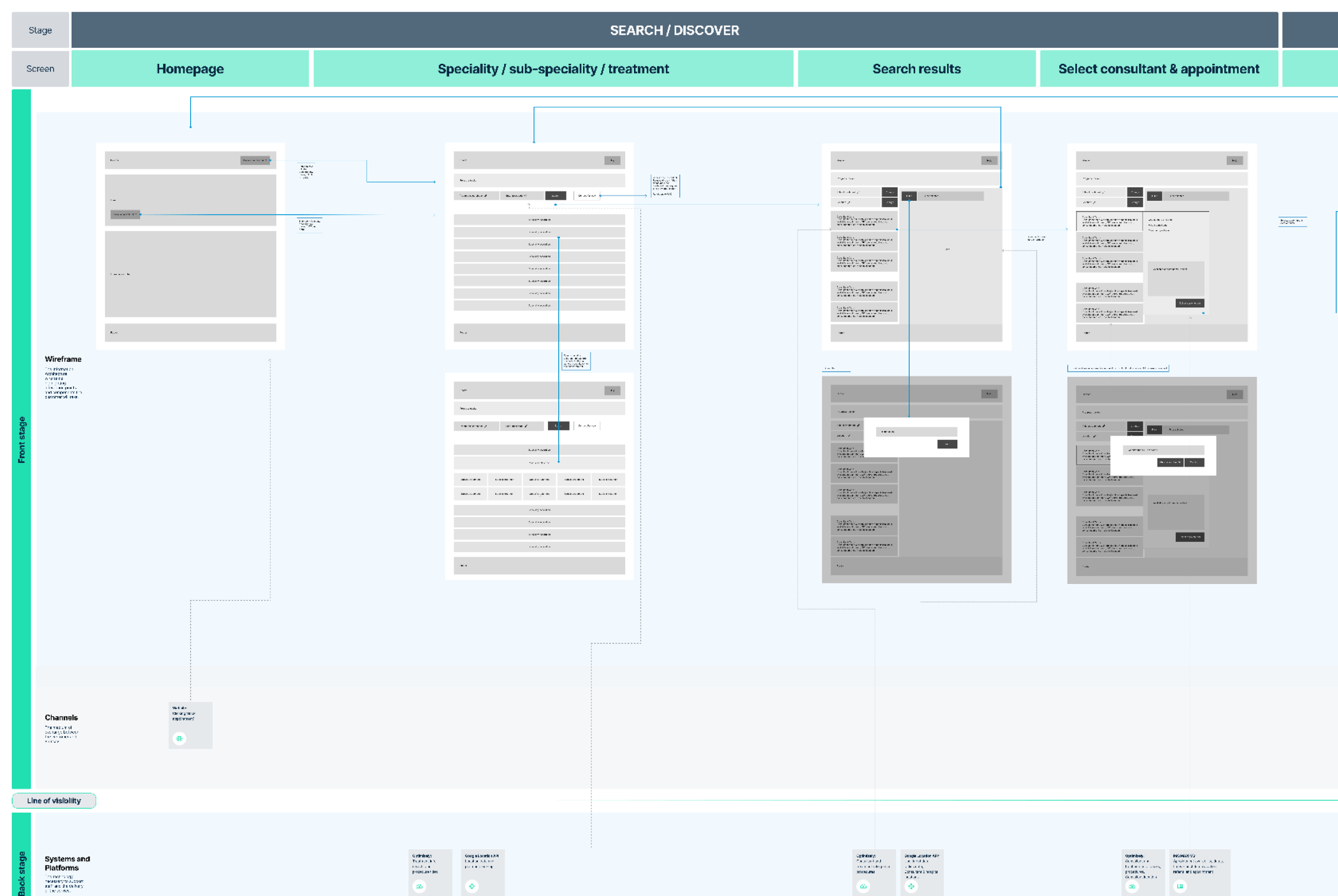
Service blueprint
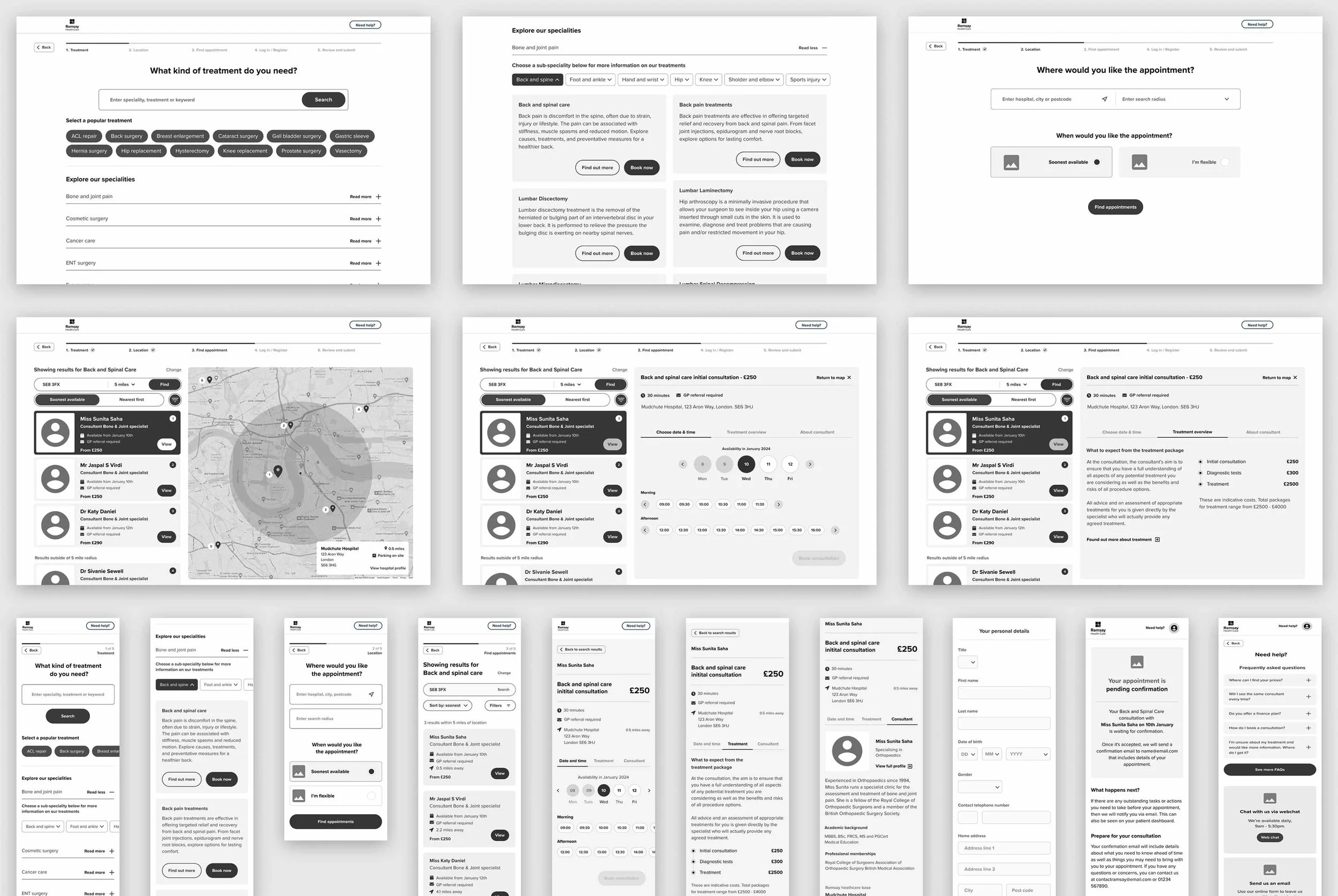
Mid-fidelity prototype for first round of testing
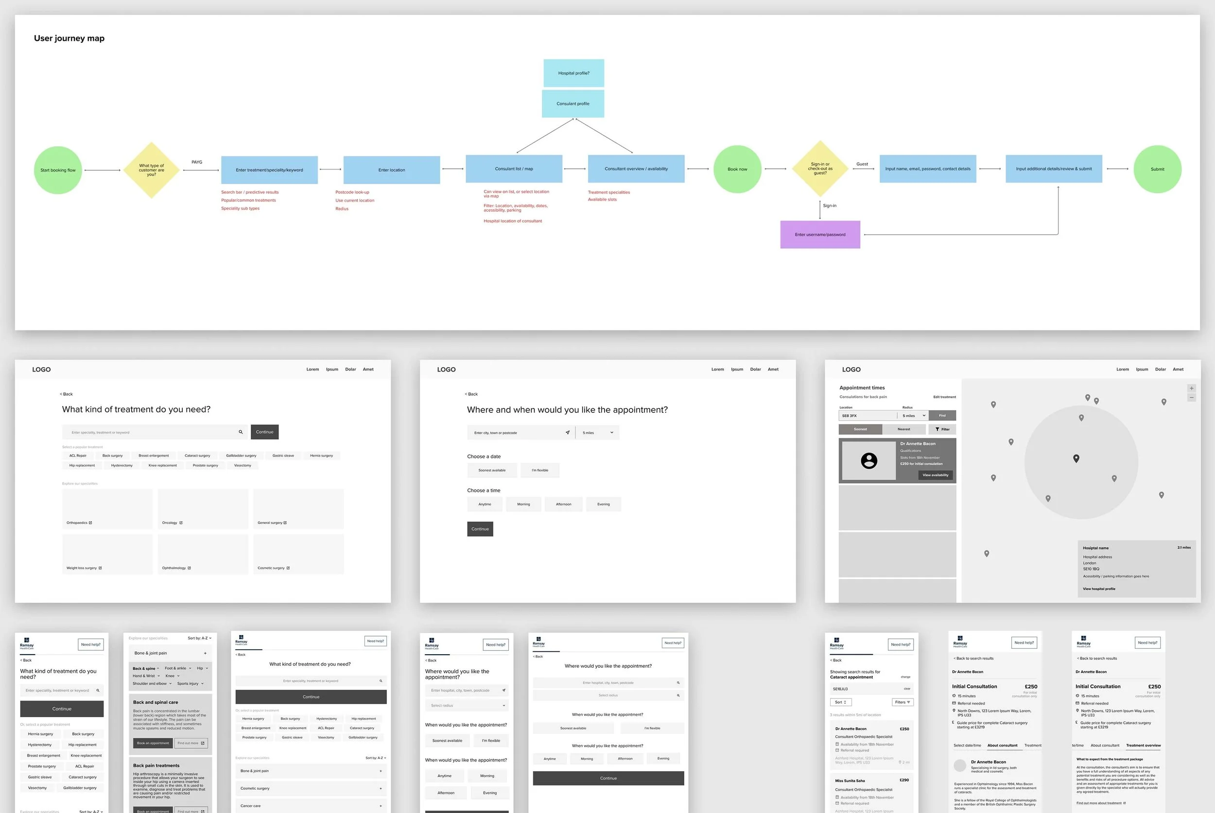
User journey map / low fidelity wireframes
User testing
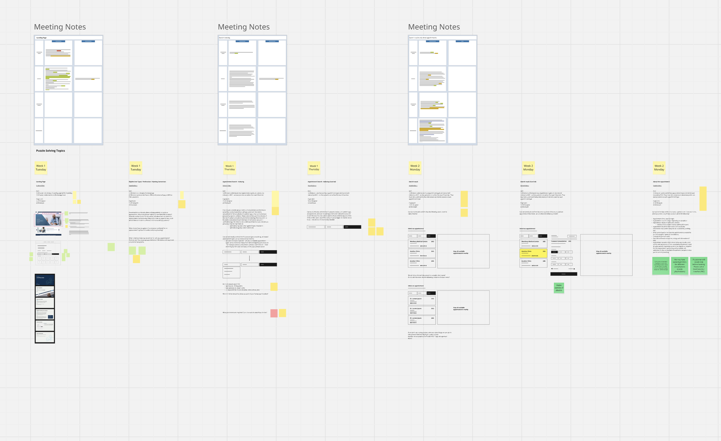
I led two rounds of moderated usability testing across mobile and desktop with participants aged 55+, including users with accessibility needs. Testing validated core functionality, exposed interaction issues early, and informed a round of A/B testing across mid- and high-fidelity prototypes before moving to build.
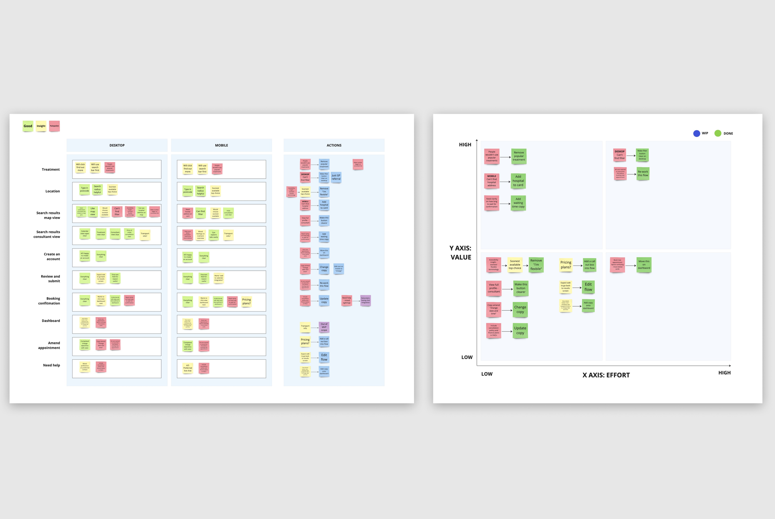
Research synthesis - affinity mapping & prioritisation matrix
A Mid-Production Pivot
During production, the client's technical team identified a critical limitation in the MAXIMS backend that had not surfaced during discovery: the system could not confirm appointments in real time, and operator staff were required to manually verify bookings to prevent double-booking. This was not a known constraint at project outset.
As a result, the originally scoped dashboard and appointment management functionality was no longer technically feasible.
.
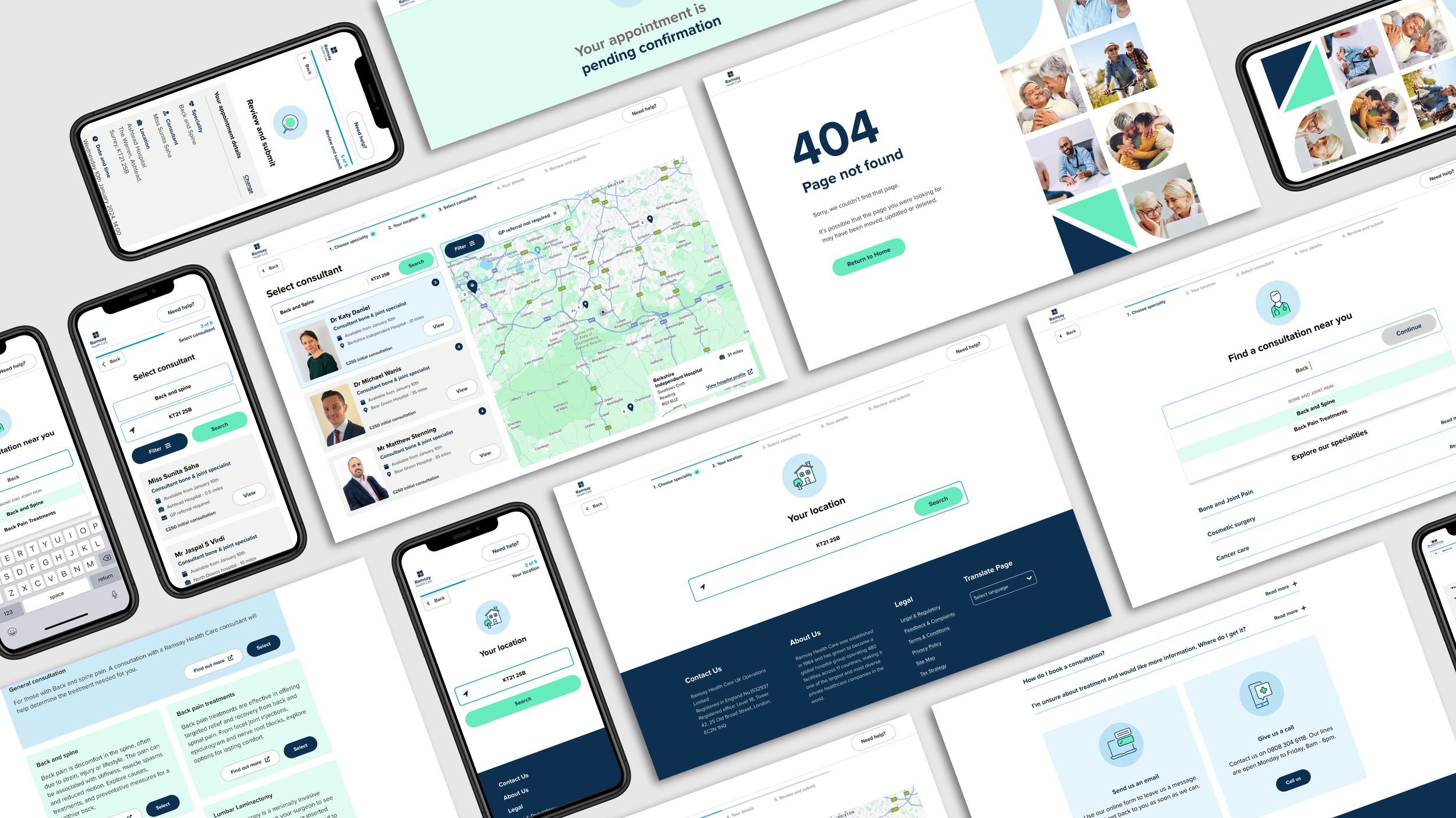
Working quickly with the team, we redesigned around the constraint — introducing an "appointment pending confirmation" state with a unique reference number, and replacing the dashboard with a lightweight booking retrieval function. Users could access their booking simply by entering their reference number and last name, a familiar pattern that required no account creation and introduced minimal friction.
The dashboard was moved to the backlog, scoped for a future release pending the client's backend infrastructure upgrade.
UI & design system
I led UI design to WCAG AAA compliance — applying high contrast ratios, clear typographic hierarchy, and accessible iconography throughout. Working closely with engineering, I also developed a scalable design system to ensure consistency across the product and give the team a solid foundation for future iteration.
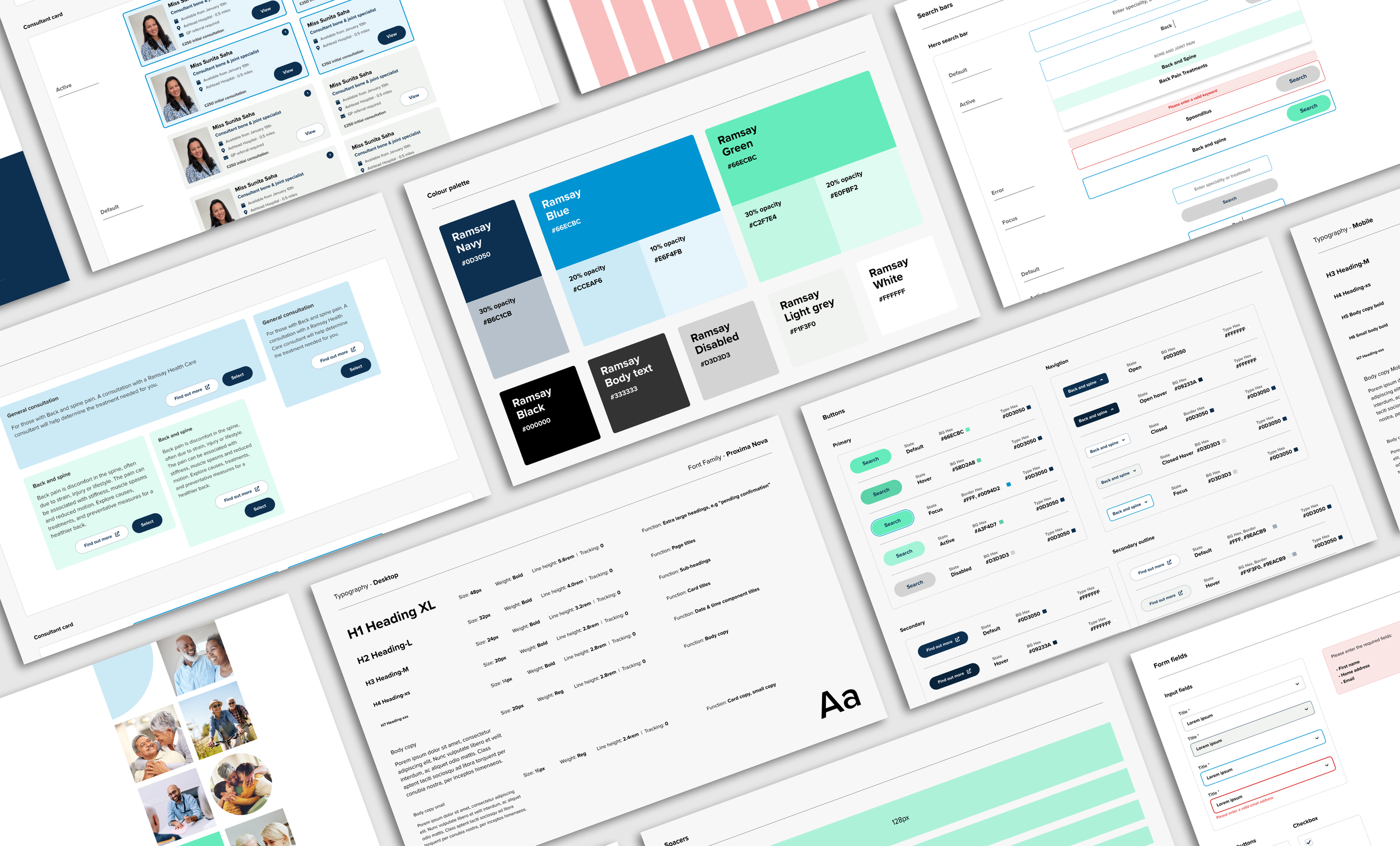
Snapshot of design system and documentation
Impact
Phased rollout
The platform is currently live at 30% of traffic, with feedback mechanisms in place to track performance and inform iteration.
Accessibility
Delivered a WCAG AAA-compliant experience, improving usability for older users and those with diverse physical, cognitive, and neurodivergent needs. These exceeds AA standards met by most competitors.
Usability
Reduced friction across key booking journeys, improving task completion rates in usability testing by over 80% after the second interation.
Conversion
Improved pricing transparency and availability surfacing, contributing to increased booking conversion
Operational efficiency
Reduced reliance on call centre support for routine bookings
Scalability
Delivered a design system ready to support future product expansion.