Hyprr case study
Role: strategy, research, product design (UX/UI), creative direction
Hyprr is the next generation de-centralised social media platform where creators can easily monetise their content and fans can support their favourite artists. Powered by its own blockchain technology, users can be in control of their data and be rewarded for their participation fairly; a much needed alternative to the mainstream social media giants. There is also a focus on community, in connecting content creators with their fans and breaking down barriers.
Being an early stage start-up, my role at Hyprr consisted of a diverse combination of strategy, research, product design and creative direction.
Strategic research
Comepetitor research
Target audience
Creative direction
My first focus at Hyprr was ensuring that we defined our target audience in order to appeal to the right people and cater to their needs. I began by conducting market research of our major competitors, including the mainstream centralised social media giants in addition to the lesser known de-centralised platforms currently on the market. By analysing the demographics and comparing features of these platforms it became clear that we should be focusing on Gen Z and Millennials. There is a trend of people within this demographic rejecting mainstream social media due to privacy violations of their data, but not being aware of any alternative platforms on the market suitable to migrate to. After examining the present de-centralised platforms it became clear why users of this demographic were not migrating to them; the free speech principle has led to an alt-right political rhetoric saturating these platforms and alienating the liberal left leaning generations who are supportive of progressive social movements.
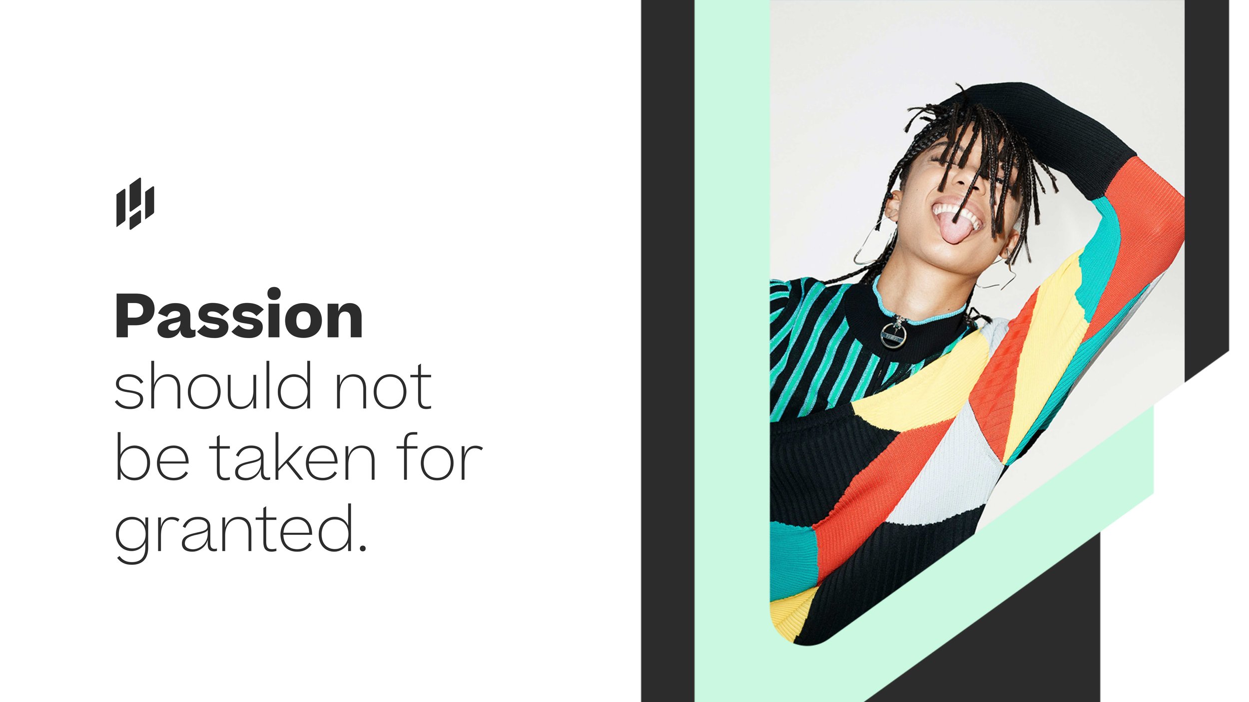
From this research, it became clear that our rebrand should be fresh, modern and progressive in look and feel with a focus on inclusion and diversity in order to appeal to our target demographic.
Logo from our freelance branding designer
Working with our freelance branding designer, I created a style guide with a colour palette and new typography to harmonise our branding designer’s new logo for Hyprr. We then collaborated on a pitch deck to help bring in revenue from investors and high profile content creators. From this, it was my responsibility to ensure these guidelines were adhered to across the new release of the app, designing top level templates, iconography and communicating this to the existing designers for them to flesh out across the app.
Pitch deck: gradients and overlays
Pitch deck: shape use
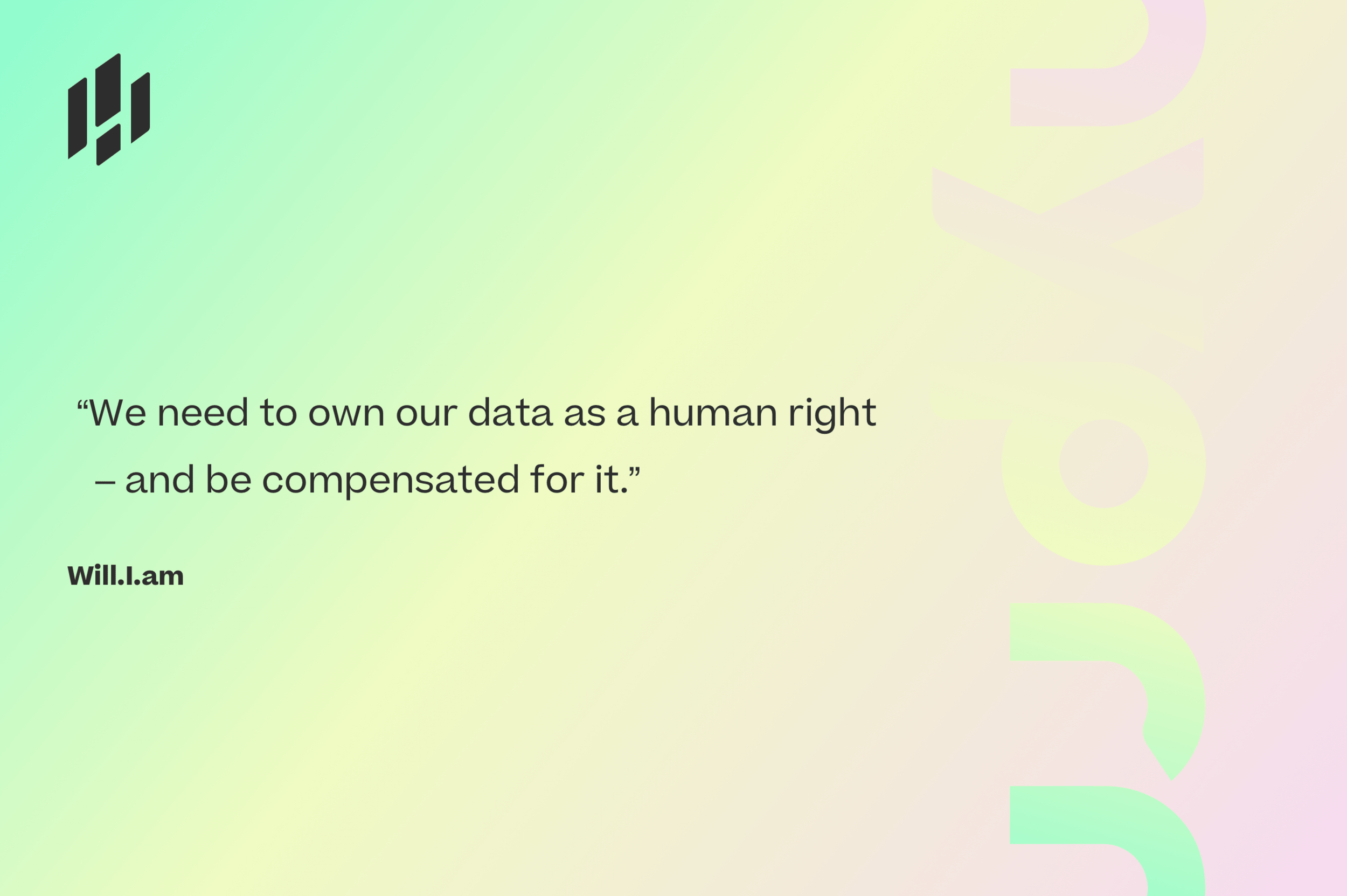
Pitch deck: quotes
Pitch deck: typography
Sign up flow
Re-design the sign up flow abiding best practices and test the concept by performing usability tests using interactive prototypes
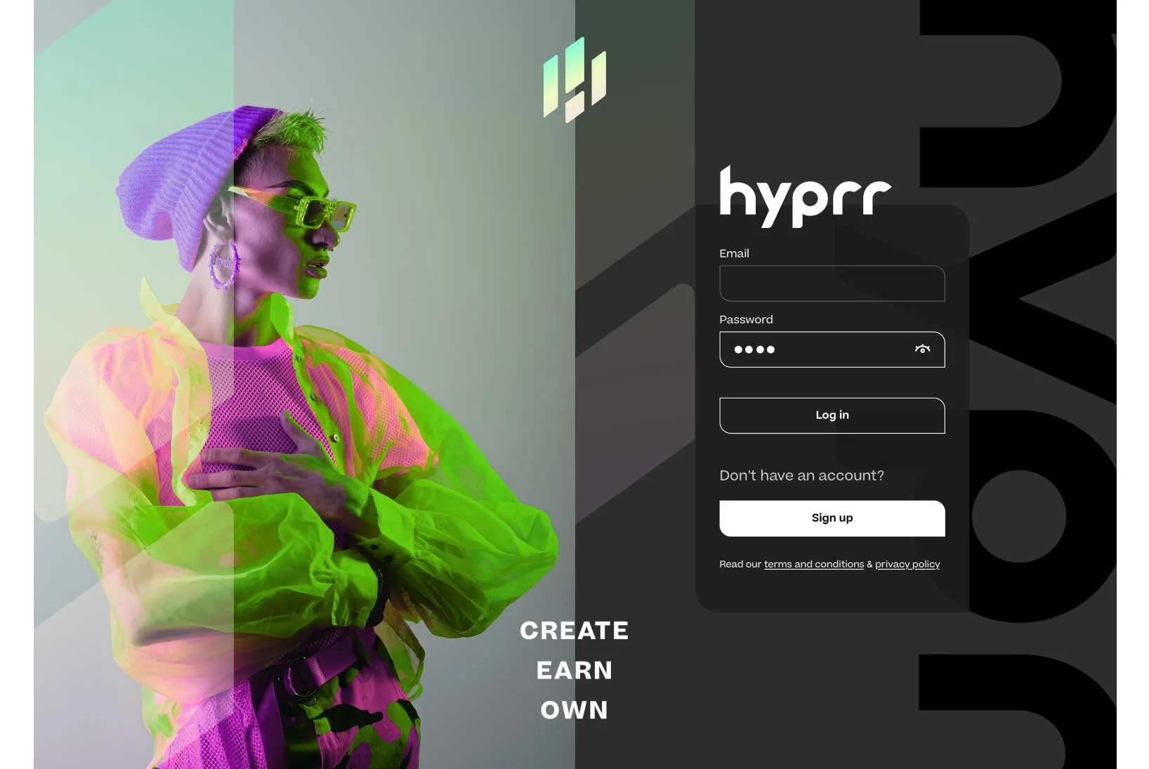
One of my first product related tasks at Hyprr was improving the sign up flow. This is often the user’s first point of contact with an app, therefore it’s paramount to build trust with a seamless, intuitive user experience.
Hyprr was immediately explorable upon entering, and like many social & content platforms, the idea is to have a feed tailored to your specific interests which becomes more relevant over time using machine learning algorithms based on your activity. As the app was in its infancy and had not yet been widely marketed (due to the much needed rebrand) there was some questionable content that may put off potential users. For example, 18+ content was displayed next to other content on the platform which psychologically leads you to question the company’s ethics and responsibility, causing mistrust. By forcing users to sign up upon entering and asking them to pick interests, we can immediately tailor content to new users and increase engagement, retention and trust.
With this in mind, I also encouraged the development of a moderation team and process for reporting content on the platform (which did not exist at the time). Hyprr is an anti-hate speech platform with a code of conduct - separate to the other decentralised free speech platforms on the market - so it became clear that we needed moderation features to accommodate this. Some of our content creators signing up were Olympic athletes who would not want their content displayed side by side with a user promoting unverified health information, therefore it was an easy business case to sell to our stakeholders.
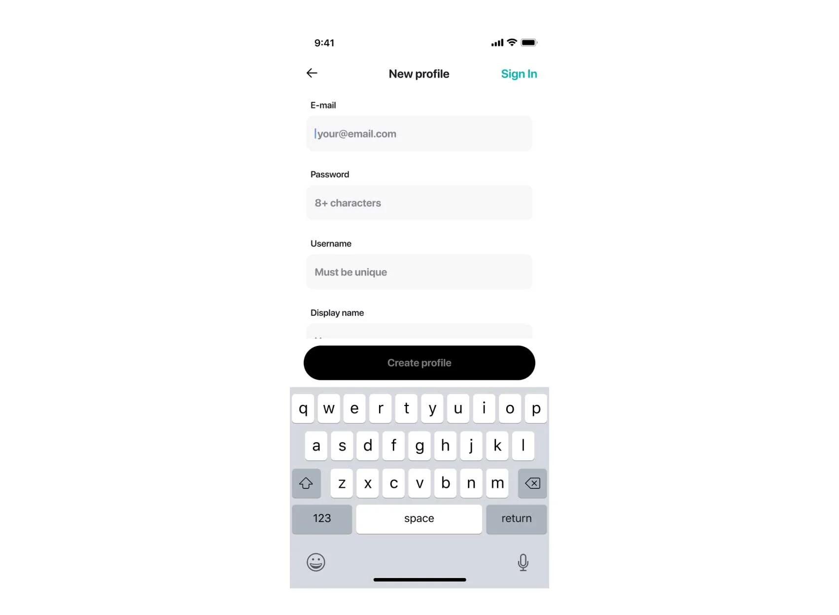
Existing Hyprr sign up screen
UX analysis - existing design
My next focus was on the user flow of the sign up process itself. The input fields were crammed into one screen making it busy and difficult to use (see existing design left). In order to improve the flow, I separated the data fields required into their respective steps, making it cognitively less overwhelming, leaving space for a written explanation, input validation, error messages, and the keyboard. In addition, improving accessibility was paramount. There were issues with coloured text on white backgrounds (see “sign in” above) failing contrast accessibility checks and certain expected functions were missing, such as the reveal password icon. The alternative option of “sign in” was confusingly placed in the top right of the screen. I changed this to the standardised UX sign up flow pattern by placing the alternative “sign in” option at the bottom of the screen - a more familiar pattern for users.
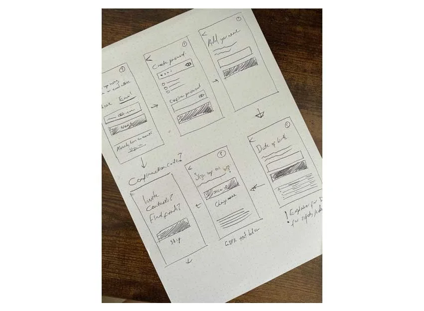
Low fidelity wireframe sketches
Wireframe sketches and initial considerations
Considering this is a decentralised platform where people are concerned about their data and privacy - it was important to improve the security of the sign up process itself by integrating 2FA. Most users of social media apps primarily interact with them via mobile (usually 90%+ of users) and many users find it easier to create an account by using their phone number, therefore, having the option of creating an account via phone or email was needed.
In addition, as this is an early stage startup, word of mouth is extremely important. Offering users incentives to share the app with their friends in return for monetary tokens (used in app, or can be exchanged for cash) is an easy way for us to increase exposure. I walked through my initial concepts with the developers to ensure that we had capacity to add these extra functionalities.
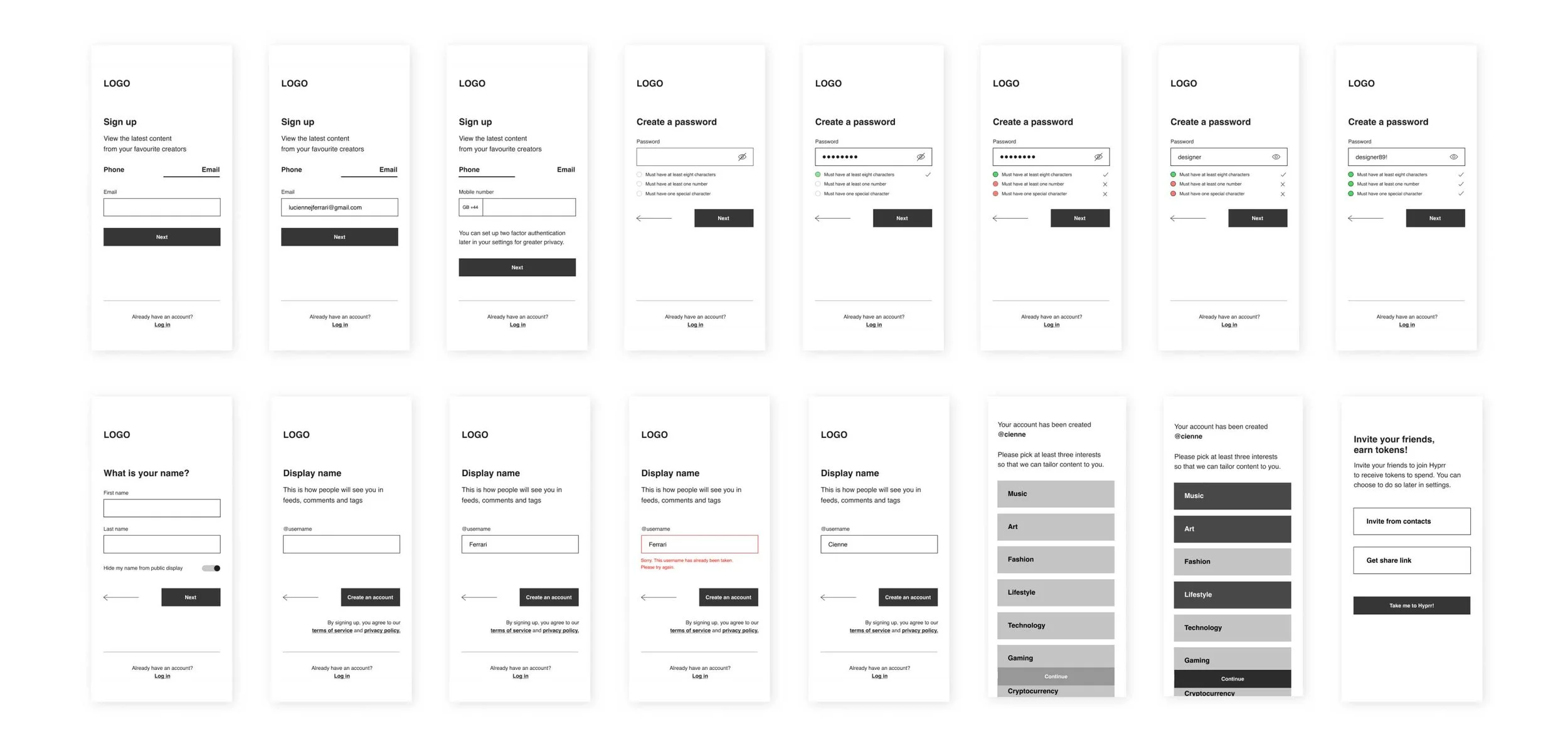
High fidelity wireframes and interactive prototype
Once designed, I tested the interactive prototype amongst stakeholders and present users of the app by conducting usability tests remotely, asking them to talk me through their thought process. From their feedback, I added pagination to the final UI to delineate steps completed so that the journey seemed less onerous. I ensured that this prototype was a high fidelity wireframe with no visual design in order to collate functional feedback.
View the interactive prototype here:
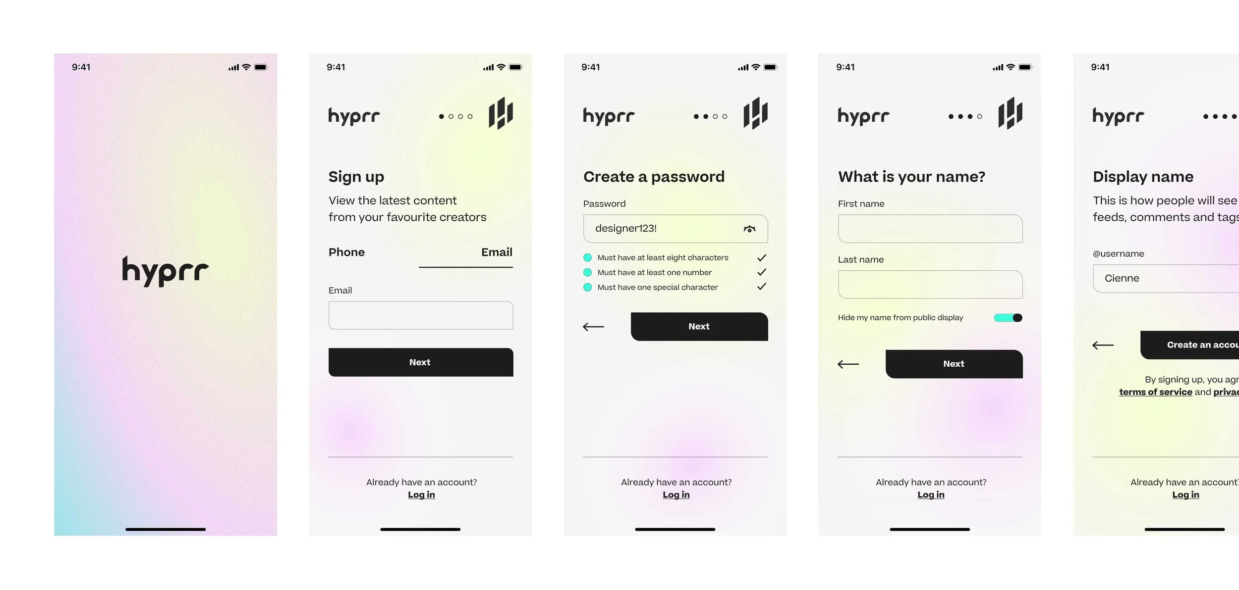
Final visual UI design
For the final visual design, I conducted A/B tests remotely with the same user groups for feedback.
View the interactive prototype here:
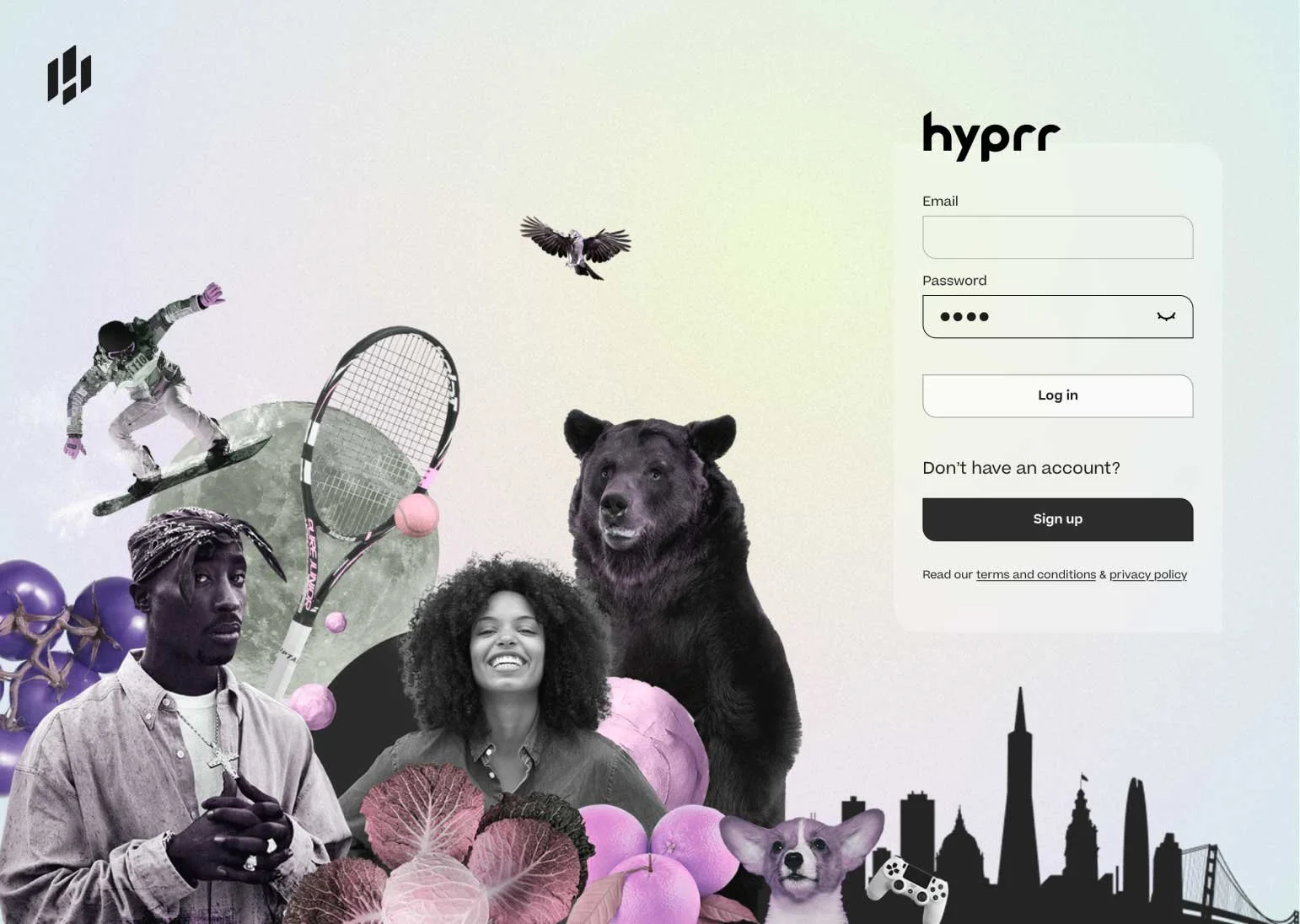
Sign up block desktop - version A
Sign up block desktop - version B
Information architecture
Improve the information architecture of the desktop and mobile apps, using data from user feedback and qualitative user interviews
The main USP of Hyprr is to essentially combine features such as posts on Instagram, videos on YouTube, streaming on Twitch, tipping on OnlyFans, whilst having a community driven ethos like Clubhouse in one app, negating the pain point that many creators have in having to maintain multiple platforms. This is of course quite a lot for one app to integrate, and so the information architecture needed more consideration.
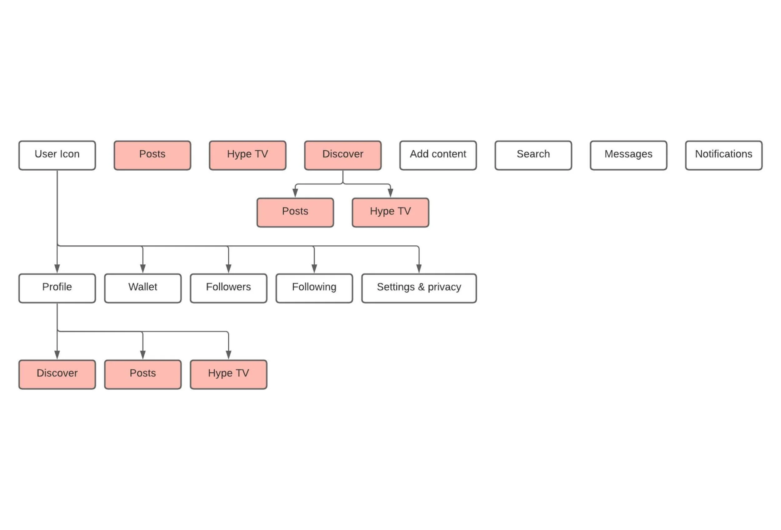
On first use, the website and mobile apps are difficult to navigate. On the top level, “posts” (short form content) and “Hype TV” (long form content) are present. These features are short and long form content from people that you are following, split into “posts” and “Hype TV” respectively. However, there are also “posts” and “Hype TV” within “Discover”. These features are to discover new short and long form content from people you are not following. Finally, there is a “discover” tab within your profile, which purpose is to allow the user to feature their own content - a completely separate feature to the main “Discover” search function. Having different features with the same name is highly confusing and leads to a stressful user experience.
My first quick fix recommendation was to remove the confusingly named “discover” tab from the user’s profile. From reviewing the in app feedback, users did not understand its function and were confusing it with the top level “discover” search function. The analytics I received from the product owner also highlighted that this feature was rarely used. There were further business requirements for the profile section (such as including paywall content) and so we would need to revisit the design regardless, therefore, this was an easy quick fix for the development team to implement.
We also needed to add a “vault” functionality so that users could easily access paywall content they had purchased, in addition to a “pinned” area where they can save content for later use.
Original sitemap
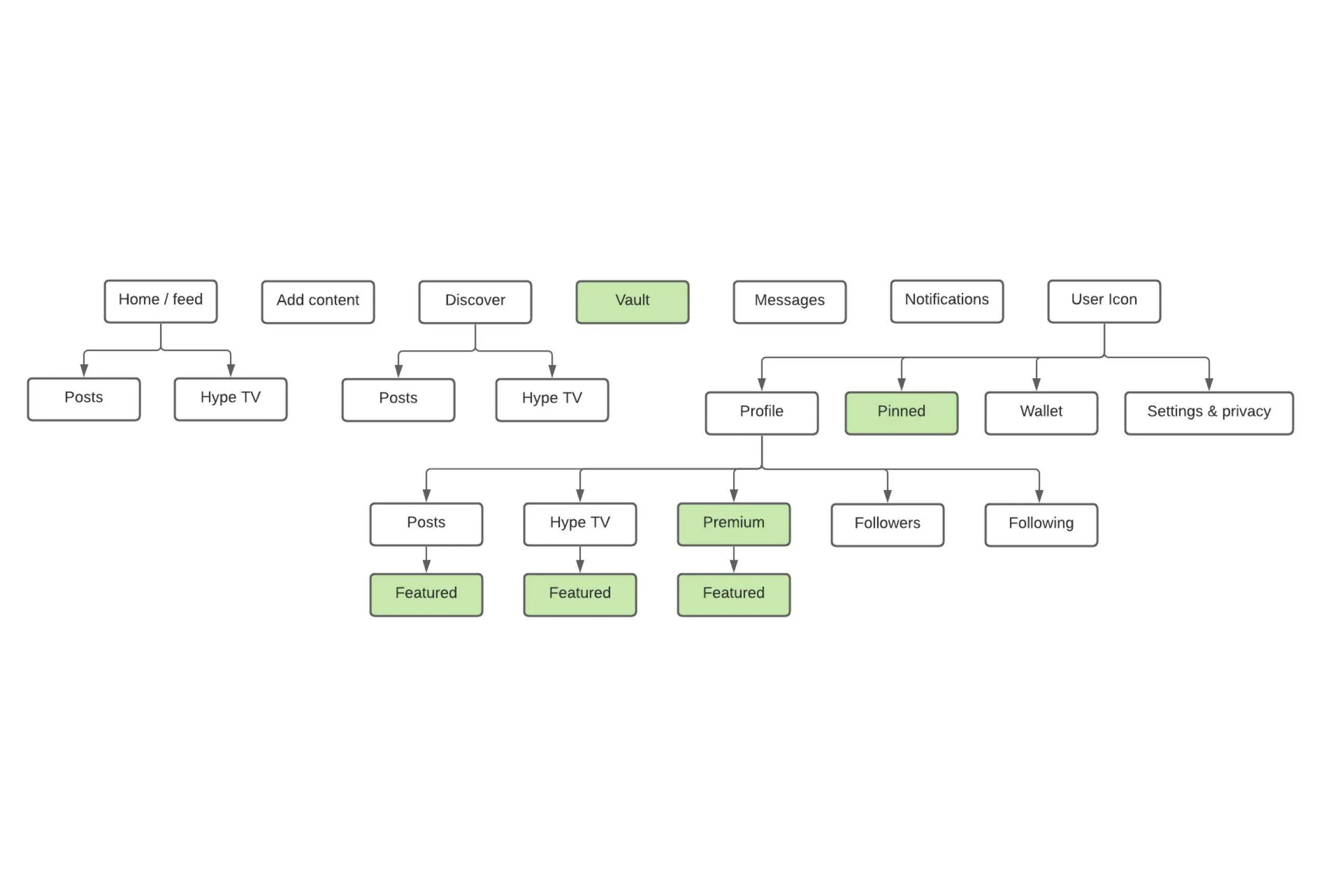
Revised sitemap
My revised site map focused on the primary user needs of our main target audience groups to streamline their user journey.
I identified three main user groups by interviewing our stakeholders, examining the habits of our present users with data analytics, and the categories of our creators/influencers (fashion, music ect.) that we had ready to onboard.
The next phase of research involved conducting qualitative user interviews with 5 creators from each of our main categories, understanding their present pain paints with social media apps and their goals. I also interviewed 12 consumers of social media outside of Hyprr to build an overview and aggregate any universal pain points these users have with social and content platforms. It was my responsibility to conduct the strategy of this research, create the interview script, conduct the interviews and analyse any trends in data.
Main user audience categories
Creators
The creators/influencers we have contracted for early access have a diverse range of specialities including: music, art, modelling, gaming, fitness, blogging ect. The app has to cater to the varying needs of these creators, for example, a gaming streamer will be using the platform in a much different way than a fashion model. The primary user needs of a gamer is to be able to live stream and have fans tip them; a fashion model will be more likely to create posts to receive likes; and a fitness blogger will be more likely to create long form Hype TV videos and encourage subscription memberships.
Whilst these creators will use different means (posts, Hype TV, streams) to achieve their goals (building a fanbase, monetising content) ultimately they have the same user goals in mind:
Adding content
Creating a paywall to monetise their content
Having their content be discovered by new consumers
Messaging and connecting with fans
Consumers
We defined consumers as people who want to consume content but have no interest in creating a living out of their own content if they did choose to add any. We would expect them to migrate to this platform from creators advertising Hyprr on a mainstream platform, and through our partnerships and sponsorships. Consumers want to support their favourite artists and content creators, either through social participation (likes, comments, shares) or through monetary means if they wish (tipping, purchasing paywall content).
Their primary goals are:
Viewing content from creators they’ve chosen to follow
Discovering similar content recommended based on their interests or who they follow
Quick access to content they have purchased
Messaging creators
Hybrid Creators & Consumers
We created a third category for users who significantly contribute content and also have a desire to consume content. These users will have a combination of the goals above. It was important to note that there is not necessarily a binary separation between content creators and consumers. From research, it became clear that creators who were significant consumers of social media themselves were more likely to have a desire for community and connection between artists and their fans.
From user research, having quick, easy access to content you’ve purchased is a primary user need so I decided to place the “vault” on the main navigation bar. “Pinned” i.e saved content was placed under the user icon, but still easy to access. “Followers” and “following” was moved to within the profile, as this is where user’s expect to find this information. Where “discover” within the profile was previously, I renamed this “featured” and put this inside their relevant sections, so that users can choose to feature their posts, Hype TV, and premium content within the correct tabs. Short form and long form content are placed with their relevant sections of who you’re currently following (Home/Feed) and when searching for new content (Discover).
New feature recommendations based on user research:
Spotlight and feature high profile content within discover
Show live streams within Hype TV
Add explorable categories within Discover
Suggest creators to follow within a user’s home/feed based on their activity